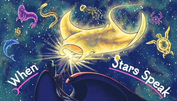
When Stars Speak
The UX design process behind a first-person job sim: read your clients' futures in the stars.
- Role
- UX Designer
- Team
- 16 people · sole UX designer
- Duration
- Mar – Jul 2026
- Status
- Shipped
- Year
- 2026
- Unity
- Figma
- FigJam
1. The game
When Stars Speak is a first-person job simulator. The player works alone aboard a spaceship as an astral consultant: clients write in asking about their future, and the answers must be read in the sky.
Each request arrives with an astral card carrying three attributes: zodiac sign, element and orientation. The player prints the request at the desk, reads the card, then moves to the telescope to compare it against the constellations that spawned that day, each with its own sign, element and position. The closest match is confirmed at the telescope and posted back through the desk. Once the day’s requests are answered, the player is free to roam the ship, and ends the day by going to bed.
The game was developed for Digital Bros Game Academy by a team of 16 — 6 designers, 5 programmers and 5 artists. As the team’s only UX designer, I led the user research, the flow charts, the wireframes, the onboarding flow and its execution, and the input mapping.
2. The challenge: four states, four control layouts
Early in development, the structure that proved most efficient for the project was built on states. A state locks the player onto the interactions available at that moment: no ambiguity about what can be done, and developers could work on different sections of the game in parallel. The game has four: bed, free roam in the ship, desk and telescope.
The trade-off: each state needed its own set of inputs, and by design they could not overlap. Our first playtest made the priority clear — players needed onboarding, and a clearer sense of which input did what in each state.
The game’s rhythm raised the stakes. Across seven days the player answers 42 requests (three on Day 1, one more each day), and every request takes at least four state transitions: desk, card inspection, telescope, and back to the desk to submit. In a single playthrough, the player crosses a state boundary more than 150 times.
A confusing transition is not a one-time cost; it is paid on every request.
What follows is how the UX design answered it.
3. Process
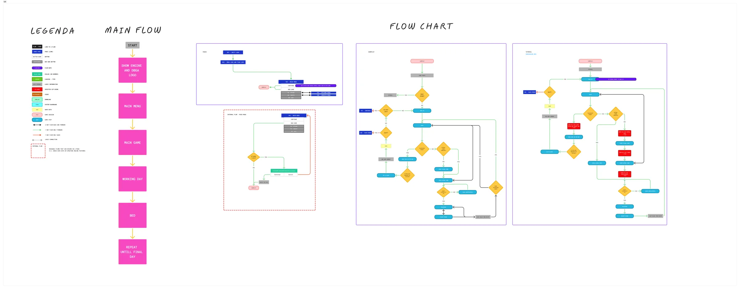
First, I drafted a legend so the whole team could read every step and passage of the game. Design had already shaped the flow and pacing, but some gameplay elements could look complex to a developer or an artist reading the GDD.
A clear, detailed flow chart removes confusion and makes every hand-off simpler.
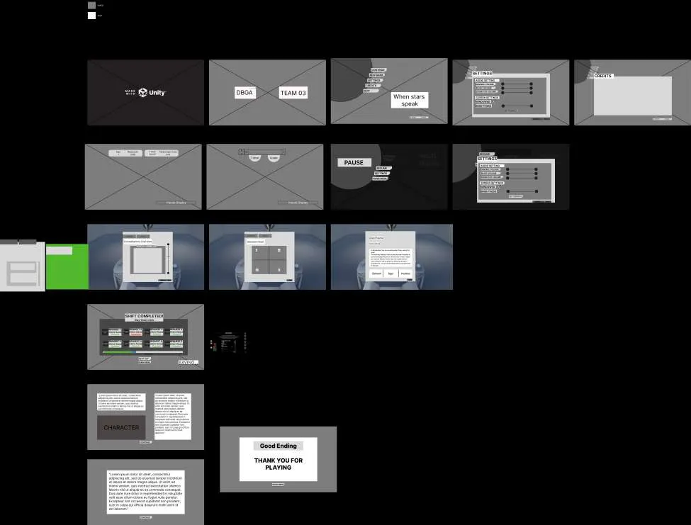
For the main menu I designed an internal flow: it can be repeated, and it tells the player that a new game is starting and that the old save will be replaced. The team chose a single save slot, so making this clear protects players from losing progress by surprise. Settling the flow early also saved the development team a lot of time in the final stages of the project. A next step for it: detecting a switch from keyboard to controller, to show buttons instead of keys.
4. Onboarding
Day 1 is the tutorial: the player gets familiar with the inputs and learns the core loop. I designed it as an inner monologue, with the character explaining step by step what to do.
It isn’t a separate level — it runs inside the real first day of work. The player wakes up on an on-screen prompt, goes to the desk and starts answering real requests while the teaching beats fire around them.
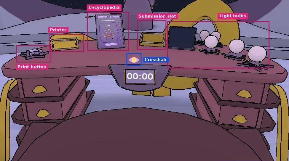
The interface is diegetic: every object the player uses lives in the game world and responds in its state. It is never interruptive: each line stays on screen for a time based on its length, dismisses itself, and never blocks input. The central pointer turns into an eye whenever an interactable object is hovered.
5. Key design decisions
Locked submission slot. The whole game revolves around reading the three characteristics on the astral card and finding the best match among the stars that spawned that day. Once a choice is made, the player posts the card back — nailing the reading or missing it. Keeping the slot locked until a choice is made was the simplest, clearest way to prevent confusion and accidental submissions.
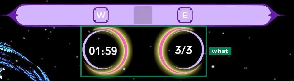
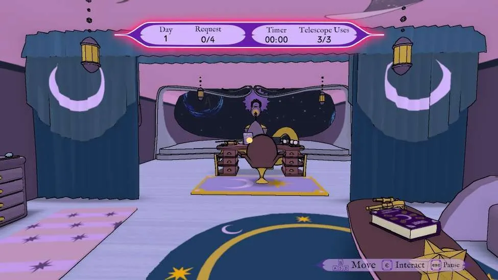
HUD. Designed so players always know where they are in the day and in the task — where, when, what. On the ship it is divided by meaning: the left side gives context (day, requests done), the right side holds the task (timer, telescope uses left). In telescope mode only the task remains. Two reasons: show only what’s essential, and build pressure by making the resources visibly run down.

Diegetic interface. The encyclopedia keeps its page between desk mode and exploration. The astral card can be moved around the table, bulbs light up as the chosen constellation’s characteristics match, and the print button has to be pressed. Each of these gives the feeling of acting in the world and shaping it — of having agency. The encyclopedia, for example, can be used without picking it up, stays in place and doesn’t reset: it feels like using a real tablet (yes, it is a tablet!).
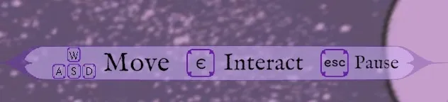
Control reminder. To reduce cognitive load and make the game more accessible, a reminder of the main inputs sits in the lower-right corner and changes with every state — the direct answer to the challenge in section 2.
6. User research and playtesting
Once the team chose the astrologer as the game’s profession, I set up a focus group to find out what makes it appealing: two participants, with me as the interviewer.
Even with a small sample, it produced the idea that became the astral card.
The first playtest, early in development, set two priorities: onboarding, and inputs that change with each state. It also showed what already worked — players loved how the telescope moved through space, like handling a real instrument, thanks to moving its controls from the mouse to WASD. A second playtest, near the end of the project, confirmed a clear improvement in how players understood the game flow and the controls, with the new onboarding and the on-screen input reminder in place.
7. Learnings and next opportunities
Research. Even a small group delivers real insight. Next time I’ll plan interviews further ahead, recruit more participants, and compare several focus-group sessions.
After launch. Clear opportunities for the next update: keeping the astral card in focus on left click, pausing the tutorial timer while the onboarding plays, and adding the minigames designed to keep the player engaged between requests.
Workflow. A leaner flow-chart legend, tailored to a first-person game, keeps the workspace clean and the team productive. I applied the same idea to the wireframes, moving unused frames to a separate page.
Structure. The onboarding and the control reminder made the state structure far clearer for players. The broader learning I’m taking forward:
A state-based structure has real strengths, but it narrows player agency and gets harder to design around as a game grows — something to weigh from day one.